We have all met those people who have a great sense of style. They can put together random stuff, and it just looks fantastic. Well, most of the time. There are times when designers who have a great eye miss the mark. We have decided to feature 100 years of styling that, well, let’s say, missed the mark. It makes you ask; What is that?
We are going to kick this off with the roaring ’20s. The assembly line has been going for 7 years. Everyone and their brother wants to take advantage of this new thing called an automobile.
These cars of the 1920s are often considered beautiful, with most vehicles incorporating design elements first found on horse-drawn carriages. However, there were some unusual and potentially “ugly” cars from this era, such as the 1921 Rumbler Tropfenwagen. This design is an unsuccessful cross between an airplane, a boat, and a car, creating an odd look topped off with a giant cyclops headlight.
What makes the Rumbler unique is its early use of aerodynamics to achieve a drag coefficient of just 0.28, better than even a modern Porsche 911 GT2 with a coefficient of 0.32. Unfortunately, being ahead of your time is not always enough to capture buyers. The company folded in 1925 after selling only around 100 cars.
After the ’20s came the great depression. The economy was drying up, people were struggling, and cost-effective, functional vehicles were needed.
During the ’30s, we were given some visually stunning vehicles, but there were exceptions.
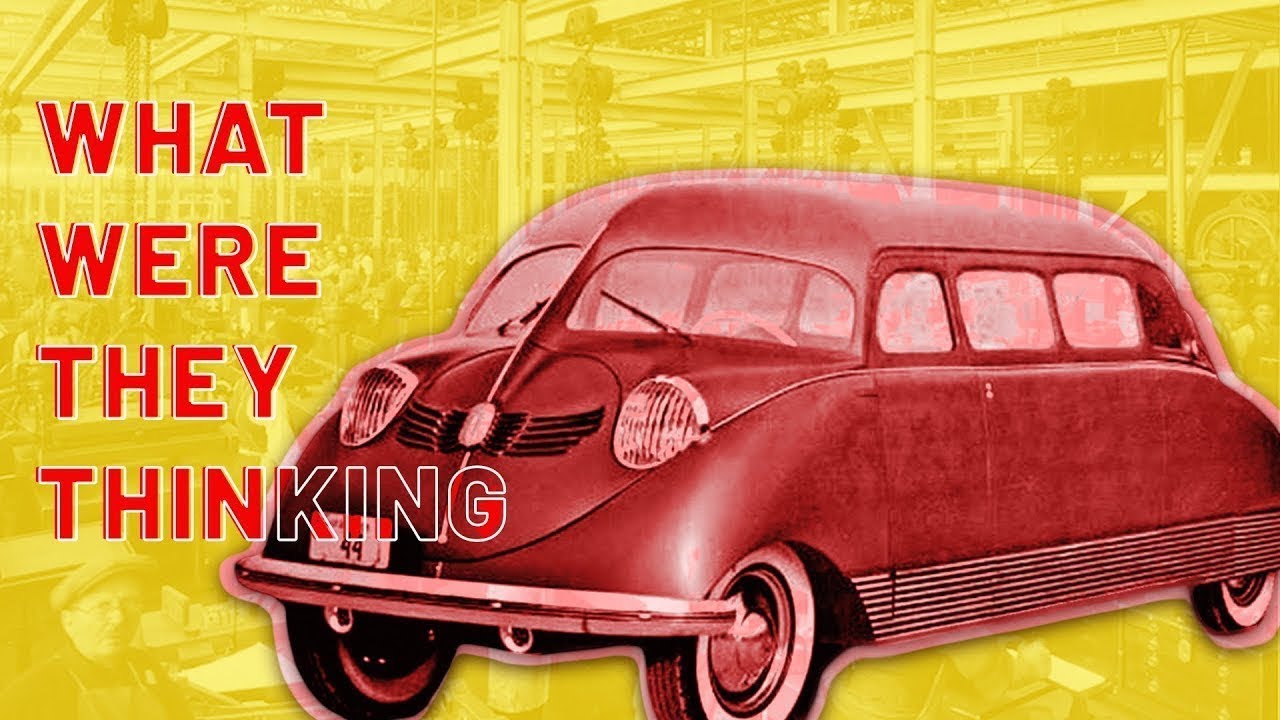
The Stout Scarab, designed by William Bushnell Stout of the Stout Motor Car Company from Detroit, is our pick for the ’30s. The Stout Scarab can be described as a streamlined cross between a Volkswagen Beetle and a Twinkie.
The Scarab was art Deco inspired and sleek, but this precursor to the minivan was far from sexy. It lacks the intricate styling and details commonly found in cars of that era, featuring slab sides with minimal ornamentation, making it appear much larger than it actually was. The overall appearance is dull and almost resembles a kid’s drawing.
However, the Stout Scarab has some unique features, such as a spacious interior like a modern minivan. It also has modern functionality, with multiple rows of seating and even small removable tables for extended trips or camping. Despite its unique features and innovations, consumers did not readily accept the unconventional design, resulting in very limited production of the Stout Scarab.
Coming out of the ’30s, the second world war jump-started our economy. But vehicle production was restricted to wartime vehicles. As a result, there were few new vehicles in the ’40s. But that doesn’t stop this next one from making the list and potentially making the all-time “what were they thinking” list. Can you guess who it is?
The Airway was a microcar with two seats, designed by Everett Miller and T.P. Hall, who had previously attempted to create flying cars. Did you catch that? We are in the ’40s, and these guys were designing flying cars. However, the Airway departed from their earlier ideas, taking on a more traditional road car approach.
Unfortunately, the design of the Airway completely lacked the sleek curves and sex appeal characteristic of cars from that era. Instead, it was tiny and had a log-like shape with disproportionately small tires and wheels, giving it an awkward and unbalanced appearance. The simple homemade-like styling of the aluminum body made the car look much less appealing than it could have been. Even selling at $750, the Airway failed to generate sufficient sales, and the company folded the following year.
This leads us into the ’50. The space age of cars. This is where the future was only limited by imagination. There were some crazy ideas of what cars should and could be during this age. But we decided to select an entire brand as the “miss the mark” designs. I will give you one hint, toilet seat? Any idea who our pick is for the ’50s?
For the ugliest car or rather brand of the 1950s, we have Edsel. The Edsel was introduced on “E-Day” in 1957 after a huge amount of hype by Ford. Ultimately, introducing the Edsel brand, named after Henry Ford’s son Edsel Ford was a marketing disaster.
What made the Edsel so terrible? Well, it’s not so bad at first glance, and it resembles many cars of the era. A land yacht with lots of chrome, bright pastel colors, and plenty of presence. However, it’s the details that kill the Edsel, and there is one that stands out above all. The grill. It’s terrible, and it immediately grabbed the attention of the public and journalist of the day, quickly earning nicknames like “toilet seat” and “Puckered lips.” Still, some took it even further, comparing it to women’s anatomy.
Unfortunately, in addition to the ugly grill, quality and reliability issues were also prevalent, further contributing to the downfall of the Edsel. Production of the Edsel ended in 1960.
The greatest challenge a president ever laid down to a nation happened during the ’60s.
Thanks to President Kennedy, the US, in the middle of a cold war with Russia, decided to turn our attention to the moon. Unfortunately, that means some designers had their heads in the clouds and needed to think more clearly.
The ugliest car of the 60s has to be the Dodge Dart; although other vehicles of the era were also quite ugly, none were as bad as the 1962 Dart.
The Dodge Dart wasn’t always ugly, but the second-generation design that debuted in 1962 was one of the ugliest cars on the list. Unlike many others on this list, it is not because of one bad detail. The Dart was ugly from every angle, and because of every detail, it was truly a visual disaster.
The front of the car features a large chrome grille and headlights in the center, but they are squeezed between two additional headlights that do not integrate well with the rest of the grill design. The rear of the car is not much better, with odd-looking taillights that do not want to be together, like an awkward family photo. The large chrome bumpers are bent down in the middle as if someone stood on them. Chrome accents wrapped around the car, both in the front and rear, only emphasize the unattractive appearance, with pointy details along the fenders topped with chrome.
Fortunately for everyone, 1962 was the only year this unappealing design was produced before it was replaced by a much better-looking model in 1963.
Shortly after we landed on the moon, the nation faced a new struggle. A new global power, the Organization of Arab Petroleum Exporting Countries or OAPEC, decided to flex its muscle during the ’70s. This caused fuel to become an expensive commodity.
That led many manufacturers to scramble to find a fuel-efficient design. The Mustang, once an American icon and a dream car for many, took a drastic turn in 1974 when Ford introduced the Mustang II, based on the Ford Pinto.
Several factors contributed to the change in appearance, including the fuel crisis, increasing insurance rates, stricter emission standards, safety regulations, economic downturns, and declining consumer demand in the pony car segment. Despite Ford’s challenges and a total lack of performance, it is difficult to understand why Ford couldn’t have designed a more visually appealing car to attract customers.
The primary issue with the Mustang II was its proportions, with a long hood and short trunk that didn’t quite work due to the overall shape and positioning of the roofline relative to the body and wheels. Furthermore, the front grill and round headlights surrounded by square bezels did not work well together. Unlike the original 1965 Mustang, where the headlights and grill had surrounding details that led into each other creating a harmonious design, the Mustang II has a headlight design that competes for attention with the grill, resulting in a choppy front end whose details do not flow smoothly together and appear unrefined. Additionally, the large regulation bumpers of the time with minimal integration added significant visual bulk and further disharmony to the design.
The Mustang II suffered from poor proportions, awkward front-end design, and many aesthetic and performance flaws that failed to capture the excitement and appeal of its predecessors.
With auto manufacturers still feeling the pressure from restrictions, economic impacts, poor sales, and the increased tension between the US and Russia, the ’80s were a mixed basket.
There were some genuinely great vehicles and plenty of terrible car designs. The one design that really stands out is the Aston Martin Logonda which takes everything about the 80’s car design and turns it up to 11, resembling what could be the grandfather of the Tesla Cybertruck.
The Lagonda’s ultra-futuristic “Folded Paper” design features an abundance of straight lines, very unusual proportions, and unique details, which set it apart from other cars of the time. The front end boasts a thin row of lights and a tiny grill, with the main headlights being large pop-up headlights located on the hood, a classic 80s feature. In fact, the Lagonda boasts 10 forward lights and two turn indicator lights for a total of 12 light bulbs, an extravagant example of 80’s excess. Inside, the Lagonda’s futuristic interior continues its excess with an all-digital vacuum fluorescent dashboard and continued angular details throughout.
Despite its uniqueness, the Lagonda’s unconventional design and steep price, which exceeded the cost of an average house at the time, resulted in poor sales and eventual discontinuation.
The cold war has finally ended! The economy is rebounding, car design improving, and electronics are making headway into vehicles.
The worst design of the ’90s goes to the Ford Taurus. The highly innovative family car was introduced in 1986. For its time, the original Taurus was a good-looking car that sold well, but that all changed with the introduction of the third generation in 1996.
The chief designer for Ford at the time, Jack Telnack, wanted the updated Taurus to stand out among other mid-size sedans in the market. To achieve this, he incorporated the Ford blue oval, the brand’s signature logo, as a repeating design element on the new car. However, this decision resulted in a comical overuse of the oval shape throughout the car’s design. The oval treatment was applied everywhere, the headlights, fog lights, turn signals, taillights, grill vents, door handles, mirrors, and even the window glass. The oval theme is carried throughout the inside of the car as well.
The excessive overuse of the oval shape detracted from the car’s overall design making it one of the least appealing cars of the era, illustrating that sometimes, too much of a good thing can completely ruin a design.
With the dreaded Y2K issues behind us, we now turn our attention to the next decade.
What decade? If we say DOT COM bubble, do you instantly think of the 2000s? The Fiat Multipla has to be the ugliest car of the 2000s, which is quite an accomplishment when you consider some of the other design flops of the day (Yes, there are quite a few in this decade!)
The front end features a stair-stepped design with a bit of a step for the bumper, which houses the fog lights, followed by a step for the hood with the integrated headlights, and yet another unexplainable step at the windshield where another set of lights and the Fiat badge reside. This unconventional design lacks coherence and fails to make the car visually appealing. The large cabin greenhouse with numerous large windows for visibility and passenger space is also a detracting factor due to its overall shape and proportion to the car’s body.
Moving to the interior, the center stack is particularly problematic, with a chaotic arrangement of unrelated shapes for the gauge cluster, gearshift lever, radio, HVAC controls, and large vents, each of which, is on their own plastic island, resulting in a very jumbled and unattractive appearance. Additionally, despite everything on the dash being intentionally rounded, the radio is entirely unapologetically rectangular, completely clashing with every other component on the center stack.
Overall, the design of the Fiat Multipla, both inside and out, is a fail. This is why many consider this one of the ugliest cars made in recent years.
As we exit the 2000s, the economy is still hurting from the dot com bust, trade towers attack, and housing market collapse. The economy has hit rock bottom, but it is slow and uncertain.
With that in mind, manufacturers needed to create something exciting to get people to buy cars. Nissan answered in 2010 with the Juke. It is a unique compact crossover with a distinctive bug-like appearance that deviates from traditional design principles such as proportion, line continuation, and visual balance. Nothing about this insect-looking mess makes design sense.
Let’s start with the front; the headlights, running lights, and signals are all over the place, with the grill awkwardly separating them from each other. The stacked headlights and running lights with the turn signals mounted above the headlights is never a good look. We see this in other ugly cars such as the Pontiac Aztec or E65 BMW. In addition to the awkward placement of the lights, the overall shape is also disappointing; we have round headlights, which are fine; we find these on many iconic vehicles, such as the Porsche 911. However, the designers decided to go in a completely different direction with all the running, signal, and brake lights. Instead of simple geometric shapes that harmonize with the headlights, they are pointy swooping designs with sharp edges that do not fit with the rest of the vehicle’s bubble shape.
The Juke received a minor design update in 2019 which refined many of the design details, but it is still an ugly car.
This marks 100 years of designers missing the mark! But you have stuck with us this far. So, let’s talk about the ’20s again.
Well, the 2020s this time instead of the 1920s. The economy is booming after the world suffered from a virus that shut the entire world down. Governments are pumping money into the economy as fast as they can print it, and interest rates are low.
The 2023 BMW i7 is a striking vehicle highlighting the importance of proportion and attention to detail. While it is undeniably a large and beautiful car, don’t look at the front.
The supersized grill design that has been finding its way into BMW’s latest models is getting bigger and bigger. The sheer size and, more importantly, its shape gives the new grill a pig-nose appearance and does not do justice to the brand’s iconic look.
The kidney grill has been a BMW hallmark for decades, but the new adaptation is laughable. While it is true that modern high-performance engines require ample airflow for cooling, and large grills are essential in fulfilling that requirement, the design details must be right. Major brands such as Audi and Lexus have successfully executed large grill designs with shapes and proportions that do not detract from the vehicle’s looks. Yet, BMW can’t seem to do this.
What’s particularly puzzling is that BMW has even carried this oversized grill aesthetic over to its electric vehicle models, which do not require a grill in the traditional sense. This design decision has raised eyebrows and caused many to question the appropriate use of obsolete design elements in future vehicles. The original Tesla is an excellent example of this. When it was released, it also had a small nonfunctional grill which was later removed in more recent models.
